8 Interior Design Website Must-Haves
[This post contains affiliate links. Click here to read my full disclosure.]
Post #7 - DIY Your Interior Design Website Series
How To Start An Interior Design Business
Why You Should Build Your Interior Design Website
Why Squarespace Beats WordPress For Interior Design Websites
Best Interior Design Websites On Squarespace
Best Squarespace Template For Interior Design
Choosing An Interior Design Domain Name
8 Interior Design Website Must-Haves
Interior Design Website Mistakes To Avoid
Why Blogging Is Important for Interior Designers
9 Tips For Writing An Interior Design Blog Post
As an interior designer, your website is your most important marketing asset. Not only is it your online portfolio, but it’s the main funnel for your marketing and sales strategies - booking those client discovery calls and selling products.
In addition to looking beautiful, there are certain website design must-haves that will help it to stand out from the crowd, attract the right audience, and convert more of your visitors into paying clients.
Here’s the short list:
1. Defined ICA (Ideal Client Avatar)
2. Website Goals
3. Clear Homepage
4. Strategic CTAs (Calls To Action)
5. Client-Centered About Page
6. ICA-Oriented Portfolio Page
7. Responsive Design
8. Style Consistency
Ready to dive in? Let’s get going!
1. A Defined ICA (Ideal Client Avatar)
Before you can get started with any of this, you need to understand exactly who you’re trying to attract to your business. Enter the ICA, a.k.a. your Ideal Client Avatar.
Your ICA is an exercise where you create a fictional ideal client or ideal client community. It’s designed to help you get crystal clear on who you really want to attract to your business and work with.
Getting to know and understand your ICA is important because it will impact virtually every aspect of your marketing and sales messaging.
Rather than marketing to anyone and everyone, drilling down on the values, habits, pain-points, and aspirations of a particular client profile will help you customize your offers and marketing messages to exactly what your ICA needs and wants.
When you get granular about your ICA, you can design your services and products with their unique needs and challenges in mind. If you're unclear about who your ICA really is, you will likely have a diluted or off target marketing message.
How to define your ICA? Get in their head! Create a set of questions to “bring them to life.”
Age, gender, occupation, family status, income, hobbies, personal style, spending habits.
Then consider more business specific questions:
What is it about YOUR services/products that would compel them to buy from you over your competition?
What are their fears and objections about buying?
What does s/he need to know to mitigate those fears and worries before deciding on the purchase?
If you’re ever stuck and unsure, think back to the services you offer, and determine what type of client your current services are a perfect fit for. Then write your ICA with that knowledge in mind.
Figuring out your ICA is crucial to your marketing success. When you truly understand who you're serving, you can adapt everything in your business to fit them. If you don’t really understand who you’re trying to attract and what makes them tick, your sales and marketing efforts will likely miss the mark.
Want to know more? Grab my 10 page workbook dedicated to discovering your ICA:
2. Website Goals
Since you took the time to figure out WHO exactly you’re marketing to, it’s time to consider WHAT you most want your ICA to do when visiting your site. In other words, it’s time to define your website goals.
While many aspects of a strong business website are universal, the nitty gritty of what you need to include will depend on your specific goals for your business and site.
So consider the question “What do I most want website visitors to do when they land on my website?”
Book a discovery call?
Sign up for your newsletter?
Purchase a product?
The answer to this will define the direction of your content. For many designers, the answer will be to book a call or consultation. This means starting with your homepage, you will include CTAs (Calls To Action) that will lead them toward booking a discovery call or consultation appointment with you.
A Clear Homepage
No matter what your website goals are, getting to those goals starts with a clear, easy to understand homepage. (See how this process follows a logical path? :) When a user goes to your website, you want to make sure they understand your business. The homepage needs to answer who, what, and why.
The first step is clearly communicating to visitors WHAT you actually do and WHO you do it for.
WHERE to do this? Your homepage headline. It’s basically the first thing people will encounter on your site.
Whether you call it an elevator pitch, a brand tagline, or in this case, a website headline, having a concise statement about your business tells the world who you are and what you do.
Search Engine Watch refers to it as a USP - Unique Selling Proposition: ”As a business, your unique selling proposition is what sets you and your competitor’s miles apart. Your USP on your landing page is how you decide to position your offering differently.”
Well said.
Need help crafting your homepage headline? Here’s a solution - my Homepage Headline Formula! The formula will show you how to drill down on exactly what you business does and write a clear statement about it. Use it on your website, your social media profiles, and anytime someone asks “So what do you do?”
Your headlines should be reinforced with a visual statement as well. Often called a Hero graphic, this image or video should convey a compelling visual message about the experience or outcome of using your services or products.
Along with the headline, sub-headline, and hero graphic there needs to be a CTA (Call To Action). This goes back to your website goals - what do you most want visitors to do? Going back to the discovery call - if that’s your goal, then your CTA should be a large, impossible-to-miss button with a CTA enticing them to click it and therefore take the next step in your sales and marketing funnel.
The headline, sub headline and hero graphic should be above the fold. Above the fold refers to the part of a webpage you can see without scrolling.
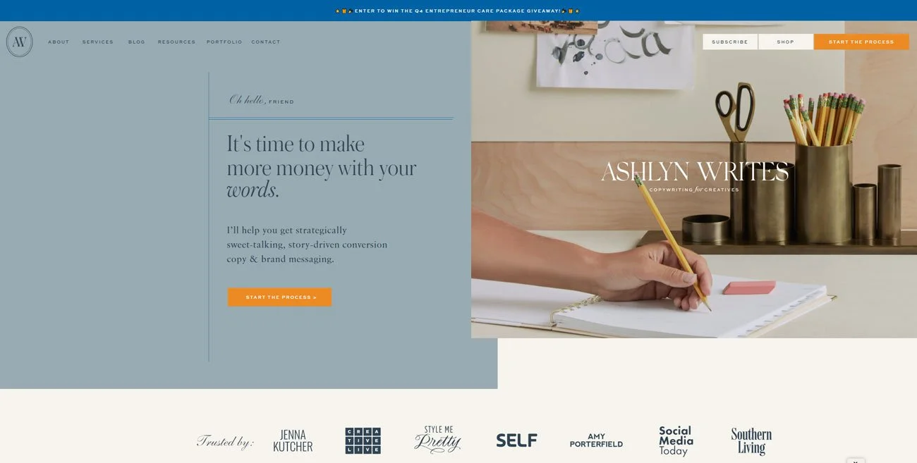
Copywriter Ashlyn Carter’s homepage has a strong headline, CTA, and hero image, along with social proof above the fold. Source | Ashlyn Writes
After your above the fold info, many small businesses chose to introduce themselves on the landing page. Why? Because key to getting people to do business with you, or bluntly put, give you their hard earned dollars in exchange for a service or product, is the “Know, Like, and Trust” factor.
How does an audience get to know, like, and trust you? That’s multi-faceted, but it starts with introducing yourself by stating why you do what you do and for whom.
Follow up your introduction with social proof. Social proof is another key to cracking the “Know, Like, and Trust” code. Here you provide testimonials from happy clients about their experience with your business, publication features, or other accolades.
You can keep it simple with quotes from the happy client, but it adds a layer of trust (and visual interest) to include a headshot of the client too. Screenshots from social media posts are also easy and effective although I can’t say I love the way they look. If you want to go the extra mile, creating a graphic with the quotes and imagery laid out together can be visually compelling which draws the visitor into the kind words about your biz.
Include another CTA on your page to give the ready yet another chance to do what you hope they will do - click through and learn more on another page, sign up for your newsletter, or go directly to your contact page to book a consultation - whatever it is you want them to do.
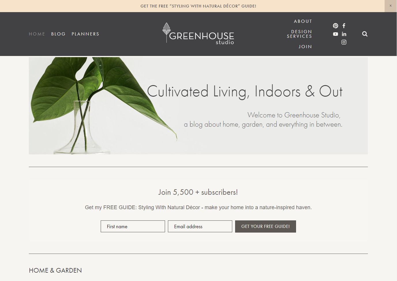
Stating my subscriber count is a form of social proof for my homepage newsletter CTA for my Greenhouse Studio blog.
Calls To Action
I introduced this in the last section, but I want to emphasize that CTAs (Calls To Action) need to be strategically placed throughout your site. Think of them as breadcrumbs that entice and lead your visitors on the journey you’ve strategized for them to take when they encounter your website.
Logical, sequential CTAs bring the potential client along a journey on your site where they learn more about you and your business as they go, building the “know, like, and trust” factor that’s crucial for them to consider hiring you.
For example, Scaled Up Studio’s homepage’s main Call To Action is newsletter signups. If someone bypasses the first above the fold CTA and moves down the page, they are met with CTAs to read my About page (which also leads to newsletter signups) and finally to a blog post (which…you guessed it - also has a newsletter signup).
Here’s another sample CTA strategy
Your homepage CTA should include your business headline statement plus a CTA.
Below that, consider an “About Me/Us” section, especially if you’re a small business, with a CTA button which could lead either to your actual About page or to your Portfolio page, both of which should have a CTA.
At the bottom of your Portfolio page could be another CTA button linking them to your Design Services page.
From Design Services, you can link to your Inquiries/Contact page where you ask to book a discovery call.
This isn’t the only way of laying out your design website of course, but it’s one way that incorporates strategic use of calls-to-action for your website visitors..
Back to those CTA breadcrumbs though:
CTAs should be eye-catching! This is where you can use your boldest accent color in your brand color palette. Create buttons overlaid with text that don’t just say “click here” but instead offer that proverbial “breadcrumb.”
In other words, “GET THE FREE GUIDE” is more action-inducing than “CLICK HERE.”
I admit I struggle with the “bold color” buttons though. I love it when others incorporate a bright eye-catching color, but my color preferences have been so neutral for a while now. So I settle by telling myself charcoal black is a great contrast against my ivory background - ha.
Squarespace makes eye-catching CTA buttons easy:
One click to insert your button, then type the CTA text, paste in the link or file, and you’re done!
An image for a free video workshop on how to find interior design clients paired with a CTA button.
Client-Centered About Page
Ahhh the dreaded About page. Many of us get hung up on About pages because we don’t feel comfortable writing about ourselves, mostly because we don’t like tooting our own horns.
So About pages can be tough to write and are sometimes met with - ahem - avoidance. We jot a few lines down about our backgrounds, a few fun facts including how we love coffee, (don’t we all?) throw up a headshot, and call it done.
So you may not be comforted to know that the About page is often the second most visited page on a website behind the homepage.
Because I know “about page” dread (been there myself!) I want to reframe the dreaded About page for you so it seems less, well, dreadful.
Here’s a secret: your About page is really about your AUDIENCE much more so than it’s about YOU.
One of the key ways to set yourself apart from others who do similar design work is your story. You are the heart and soul of your business. People are naturally curious and want to know more about the person behind the curtain so to speak.
Why do you do what you do?
How did you get here?
Who do you do it for?
Again, people hire and buy from people they know, like, and trust.
Your main job with your About page is to make the reader feel like you understand them at their level, and in turn, to make them feel comfortable with you stepping into their world (literally in the case of interior design) to the point where they’re willing to pay you for your services/products.
1.So start with a strong headline. Instead of the usual “Hi, I’m Jenny!” write something that lets the reader feel understood by you. Then write a sub-headline that reassures your potential clients they’re in the right place.
2. THEN introduce yourself and follow up with your creative credentials:
It’s time to transform your house into a home
So many moving parts, decisions to make, and what about that budget?
That’s where I come in.
Hi, I’m Jenny! Interior designer, furniture wrangler, and moving parts coordinator.
I’m here to help turn your house into a home. Beautifully, efficiently, and on-budget.
(OK I’m not claiming that’s brilliant copy, but you get the idea.)
3. Next, introduce your reader to what it would be like to work with you. What’s your process? Show it in a simple, clear way; imagery showing you in your element, doing what you do is always good.
4. Include a testimonial, “featured in” or other accolades.
5. Follow this with a few fun facts about you so your readers can get to know you outside of your work.
6. Insert your CTA - what do you most want them to do now?
There’s more than one way to… (not gonna say it!) but wireframe will get your About page working harder for that “know, like, and trust” factor than the usual lackluster “About Me” or “Meet So and So” type pages.
Enough said!
ICA-Oriented Portfolio Page
If there’s one page that gets designers and creatives in a twist, its the portfolio page, right? What to include, what not to include. How to lay it out. On and on.
This is my two cents, but I don’t think you should over think it too much. At least try not to overthink it anyway. A less is more approach and keep it simple attitude is often best.
Remember, clients and employers are hiring people as much as they’re hiring a skillset. You can be the best designer out there, but if you’re difficult to work with, miss deadlines, or behave like a prima donna, your mad design skills are going to plummet in value by comparison. So let your sparkling personality, positive attitude, and stellar work ethic shine through!
So my main “big picture” portfolio suggestion is going back to the beginning: design your portfolio with your ICA in mind. If you’re specializing in kitchen and baths now and want to attract those clients, showcase any kitchen and bath work front and center, even if the bulk of your prior experience was in something else.
[If you’re starting out and don’t have a portfolio yet (or are switching from one specialty to another, i.e. - you have a new ICA) I’ve got you covered! Check out “Creating a Portfolio When You Don’t Have Your First Client.”]
Some general portfolio organization suggestions:
Project type - e.g. residential, commercial, kitchen & bath etc.
Category type - rendering skills, construction details etc.
Project timeline - starting with mood boards and conceptual sketches and ending with final renderings and construction docs.
Timeline of your project work - most recent (best projects) first.
Regardless of what and how you decide to layout your portfolio work, Squarespace has you covered with dedicated Portfolio Page Sections showcasing various layout options.
Christian Barrett Landscape Architecture’s ICA is high-end residential clients in Napa and Santa Barbara. He does commercial work, but it’s not his main ICA, so we featured residential work in his portfolio. Source | Christian Barrett Landscape Architecture. Website Design | Scaled Up Studio
Mobile Responsive Design
You may spend much of your day in front of a giant desktop monitor (I know I do) so it may surprise you to learn that at least 50% of your traffic will come from mobile views.
So what the heck is responsive design and what does it have to do with mobile traffic?
W3Schools.com‘s definition is “Responsive Web Design is about using HTML and CSS to automatically resize, hide, shrink, or enlarge, a website, to make it look good on all devices (desktops, tablets, and phones).”
In other words, you will design your site on desktop, but how will your site look when shrunk down to mobile or tablet? Again, with about 50% of web traffic coming from mobile devices, this is a crucial aspect of any website design.
Fortunately, this is no problem with Squarespace - your site is automatically mobile responsive. Unlike Showit where you have to completely rebuild your site on mobile (no thanks!) or WordPress that makes you jump through many mobile-responsive hoops, Squarespace is mobile responsive out of the box.
Do Squarespace sites need tweaking for mobile? Yes, you’ll make some adjustments, but it’s easy and quick.
Style Consistency
Consistency is important on so. many. levels. as a business owner. Right now though, we’ll just stick to style consistency!
Just like any design project, your website needs consistent styling. Specifically, I’m referring to fonts, colors, and imagery here. Ever seen those websites where it looks like whoever “designed” it chose to include just about every font and color scheme they found appealing with a few random images thrown in?
I call them Frankensites - because they look like they were cobbled together from all sorts of “inspiration” sources.
Maintaining consistency can be challenging in website design. Sometimes it just seems like it would be interesting/better/whatever to be able to use that different color/font just this once in just that spot. I totally get it and have been there myself!
It’s really important though to maintain consistency to avoid a jumbled or piecemeal look on your most important sales and marketing tool. It just doesn’t instill confidence, especially on a design/creative business. Cohesiveness is key.
With that in mind, here are a few basic recommendations:
Keep your fonts limited to two (possibly three in special instances) and just change up the scale and spacing to set different header and paragraph styles.
Decide on a brand color palette and stick with it. That doesn’t mean it can’t evolve if your needs change, but keep it consistent on your site.
Keep your imagery as cohesive as possible. When using stock imagery try to stick with one photographer’s collection when possible. When having your portfolio work photographed, find a photographer you’re happy with to keep a consistent style/look to your different projects.
Squarespace makes styling consistency simple through Site Styles. All of your fonts and color palettes are housed here where you can set styling options that are applied globally.
With 600 Google fonts and 1,000 Adobe Fonts, Squarespace has lots of font choices. You’ll select only a couple, (or upload your own brand font) style and assign them to specific purposes, which will then be applied globally on your site.
With curated color palettes, you can make changes to all your site's colors at once, or customize the colors for individual site elements.
Plug your brand colors into your Palettes.
If you need a color palette, Palettes provides preset palettes in curated colors.
The Color Picker lets you generate palettes that work with your color.
Upload a favorite image to the Palette Editor to generate your palette based on its’ colors.
An interior design color palette mood board. BTW - you can get this Canva mood board free when you join my email list and respond to my first email.
Why Squarespace Is The Best Choice For Designers DIYing Their Business Website
As you’ve *probably* guessed, I think Squarespace is far and away the best choice for designers and creatives who want to build and maintain their own site.
It was designed with the visual arts in mind, and a whole lot of attention is devoted to showcasing your best work easily and beautifully.
Its out-of-the-box drag and drop building platform makes designing and maintaining your website simple and fast rather than frustrating and time consuming.
If you’ve been with me for any time, you know my whole platform is that your website is your most important sales and marketing tool. So as a business owner, being able to change up your own website is crucial to being able to dynamically respond to your unique business needs.
What are your website must-haves? Leave me a comment below.
Considering DIYing your design website? Grab my DIY Website Design Checklist:
New to Squarespace? You can sign up for a free trial, and I can even get you a discount! Use code GREENHOUSE10 to save 10% off your first year.
Other interior design business-building posts you’ll love:
Don’t forget to Pin it for later!
If you have any questions or comments, please drop me a note below. Be sure to check back for my response (I always respond) since no notification is sent.


