How to Create a Client-Winning Interior Design Homepage
Your interior design website homepage is the online face of your brand; it’s your online business card. It’s purpose is to convince visitors to stick around and check out your portfolio, design services, and ultimately book a Discovery Call or purchase a product.
So how to structure your homepage so it attracts clients?
If you’re not sure, don’t worry! In this step-by-step guide, I will show you how to maximize your homepage potential. So, whether you're a new interior designer creating your first website or a seasoned pro looking to optimize your existing site, let’s take a look at what you need to build a strong homepage that will grow your design business.
Homepage Structure for Interior Design & Architecture Websites
If we think of a website as a house, then your homepage is the foyer or entry hall. It's often the first thing visitors see. It’s crucial to make a good impression and capture their attention, but you also don’t want them lingering too long.
You want to warmly welcome them and convince them to stay for a while, but you also want to direct your visitors into another room pretty quickly.
The structure of your homepage plays a crucial role in determining whether visitors will engage with your content or move on to another site. A well-structured homepage can help guide visitors through your site, highlight your products or services, and ultimately increase your conversion rate.
A successful interior design homepage includes:
a clear value proposition
attention-grabbing headlines
high-quality imagery
a prominent call-to-action
clear navigation
social proof
mobile responsiveness
If we think of a website as a house, then your homepage is the foyer or entry hall. You want to warmly welcome visitors and convince them to stay for a while, and then direct them into another room.
Know Your Ideal Client & Create a Clear Value Proposition
To create a clear value proposition, you first need to understand your target audience or ideal client community and their pain points. What are their unique needs and wants? What are their challenges and frustrations?
By understanding your target audience, you can create a value proposition that resonates with them and speaks to their specific needs.
If you’re unsure about who you want to serve as an interior designer, I have a FREE tool to help with defining your Ideal Client Community:
Write a Clear and Compelling Headline / Business Tagline
Your value proposition, or to put it in specific web design and marketing terms - your homepage headline or business tagline, is the unique selling point of your business. It should be prominently displayed on your homepage - as either an H1 or H2 heading with additional subheading(s) to expand on your main headline as needed.
Your value proposition/homepage headline/business tagline should be simple, specific, and memorable. It should answer the question, "How are you different from your competitors?" In other words, what do you do, who do your serve, and why should someone choose to work with you?
Check out the heading structure below for my Squarespace template custom-designed for interior designers:
Your homepage headline is your unique selling point communicating what makes your interior design business different. It should be prominently displayed on your homepage.
Need help crafting your brand tagline/homepage headline?
Using High-Quality Images and Videos
I’m preaching to the choir with this one! As a home design professional, no one understands the importance of high-quality imagery better than you. However, I will still shout it out for the people in back:
The quality of your imagery can make or break your website’s aesthetic.
If you can have a relatively simple website yet beautiful imagery - your site will probably look great. On the other hand, if your portfolio is small, then a strategically designed website template is even more important.
A simple website with beautiful imagery is a winner. If you don’t yet have a huge portfolio, a strategically designed website template is even more important.
High-quality images and video will enhance engagement and communicate your aesthetic. It will help communicate the kind of design services you offer and the benefits of working with you. High quality photography of your work will help establish trust and credibility with your target audience.
In the case of an interior design or architectural website, pictures are worth a thousand words as the saying goes. You can state what it is you do, but quality images and video documenting those claims provides proof.
So what to do if you don’t have a large portfolio? No worries - everyone starts there, and I’ve got you!
Check out this post: Portfolio Ideas For Interior Design Students and Up-And-Coming Interior Designers
Ahem - Important distinction here about website imagery:
Imagery is key to making your visitors want to work with you AFTER they have found your website. Imagery is NOT what will bring your ideal clients to your site. Why? Because search engines can’t “read” images.
How do you get visitors to your website? That my friend, is the whole purpose of SEO (search engine optimization). Read all about SEO for Interior Designers & Architects.
Creating a Clear and Prominent Call-to-Action
Your call-to-action (CTA) is the action that you most want visitors to take on your homepage. Remember above when I made the website-is-like-a-house analogy? The homepage is the entryway/foyer and you want to warmly greet your visitors and then direct them to another room. That my friend, is the job of a well-designed CTA!
Your CTA should be clear, concise, and prominently displayed because it’s sole job is to encourage potential clients to take action. You will have more than one CTA on your homepage, but the most important one should be located above the fold - which means in the upper portion of the page that’s visible when your webpage loads.
For most interior design business sites, the CTA will be to encourage people to schedule a Discovery Call. You will likely have a CTA for that on your homepage, and I recommend placing it in your header.
Visitors will want to check you and your work out first, so your CTAs should direct them to other pages where they will get the information they need to make a decision about booking a Discovery Call - e.g. your About, portfolio, and design services pages.
The interior design website template homepage CTA sits above the fold.
To create an effective CTA, use action-oriented language that will address the pain-points and/or desires of your ideal client community. Make your CTA prominent and experiment with button styles, color palettes, typography, and placement to determine what will be the most effective.
Creating a Navigation Menu That's Easy to Use
Your navigation menu is the roadmap for your website. It should be prominent, simple, and clearly organized. To avoid overwhelm, I recommend not having more than 6 links. Submenus that drop-down from your links are fine, but do not clutter up your primary navigation with excess links.
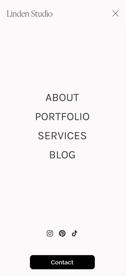
See the above image - the Primary Navigation has four links - About, Portfolio, Services, Blog. The Homepage is accessed via the site title/logo on the left and the header CTA is the Contact button.
Social Proof - Client Testimonials to Build Trust and Credibility
Social proof is a powerful tool for building trust and credibility with your target audience. When a potential client doesn’t know you, a testimonial helps establish your brand as an authority and builds trust in you and your design services.
Testimonials, “featured in”, and brand collabs all work great as forms of social proof.
Social proof can provide the nudge your potential clients need to make them feel comfortable enough to take action toward working with you.
Featuring client testimonials and companies or organizations you’ve worked with helps build trust with site visitors. This info is below the homepage fold but the navigation bar is set to stay visible.
Optimizing Your Homepage for Mobile Devices
Chances are, at least half of your website traffic will come via mobile device. It is therefore crucial that your homepage and every page on your site be optimized for mobile viewing. Referred to as “mobile-responsive design”, this means that your homepage should be easy to read and navigate on a small screen.
To accomplish this, your homepage content must be able to adapt to viewing on a smaller screen size and in the opposite aspect ratio of a desktop computer.
In practical terms, this typically means simplifying your navigation menu, reorganizing some of your content, and adjusting text and spacing so it’s easy to read. If your website is built on a platform like Squarespace, a mobile layout is performed automatically, and you just makes tweaks as needed. How much work goes into creating a mobile-responsive design varies greatly from platform to platform.
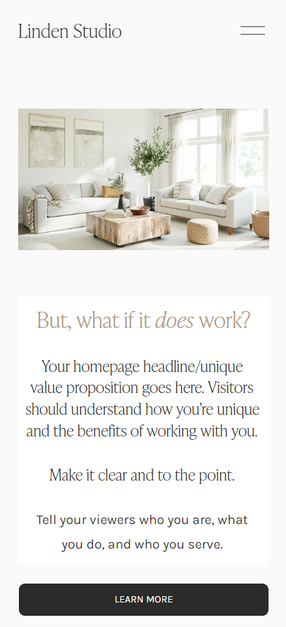
Squarespace’s mobile-responsive preview. Note the primary navigation is condensed into a “hamburger” menu.
The hamburger menu when touched expands to display the primary navigation.
So those are the key homepage elements!
There you have the main components of an effective homepage for an interior design website. I hope you got some good ideas for either a new homepage or some inspiration to spruce up your existing one. If you have any questions, don’t hesitate to leave me a comment below.
New to Squarespace? You can sign up for a free trial, and I can even get you a discount! Use code GREENHOUSE10 to save 10% off your first year. (affiliate link)
New to Squarespace? You can sign up for a free trial, and I can even get you a discount! Use code GREENHOUSE10 to save 10% off your first year. (affiliate link)
Other interior design business-building posts you’ll love:
Don’t forget to Pin it for later!
If you have any questions or comments, please drop me a note below. Be sure to check back for my response (I always respond) since no notification is sent.


