Best Interior Design Websites On Squarespace
[This post contains affiliate links. Click here to read my full disclosure.]
Post #4 - DIY Your Interior Design Website Series
How To Start An Interior Design Business
Why You Should Build Your Interior Design Website
Why Squarespace Beats WordPress For Interior Design Websites
Best Interior Design Websites On Squarespace
Best Squarespace Template For Interior Design
Choosing An Interior Design Domain Name
8 Interior Design Website Must-Haves
Interior Design Website Mistakes To Avoid
Why Blogging Is Important for Interior Designers
9 Tips For Writing An Interior Design Blog Post
20 Examples of Interior Design Websites On Squarespace
Are you a new interior designer planning to DIY your website and looking for some design inspo? Or maybe you’re established but you know your site needs a refresh? Well either way, look no further!
I’ve combed the internet for some truly inspiring Squarespace interior design websites. OK not all are strictly interior design - a few are home décor ecommerce and artists, but all will inspire you! Squarespace was designed with the creative entrepreneur in mind, so the results here are both beautiful and strategic.
As you look at these sites, don’t just look at the gorgeous imagery, but I’d like you to really look at what I call “website strategy.” If it’s a client service-based interior design site, how is the navigation and content presented differently from how a blogger’s home décor site or straight up ecommerce site is laid out? What’s the hierarchy of information? You’re sure to spot some “take home” lessons that could be applied to your own website.
Anyway, I swear I’ve never had so much fun putting together a post, and I definitely got some ideas of my own! Come take a look below.
New to Squarespace? You can sign up for a free trial, and I can even get you a discount! Use code GREENHOUSE10 to save 10% off your first year.
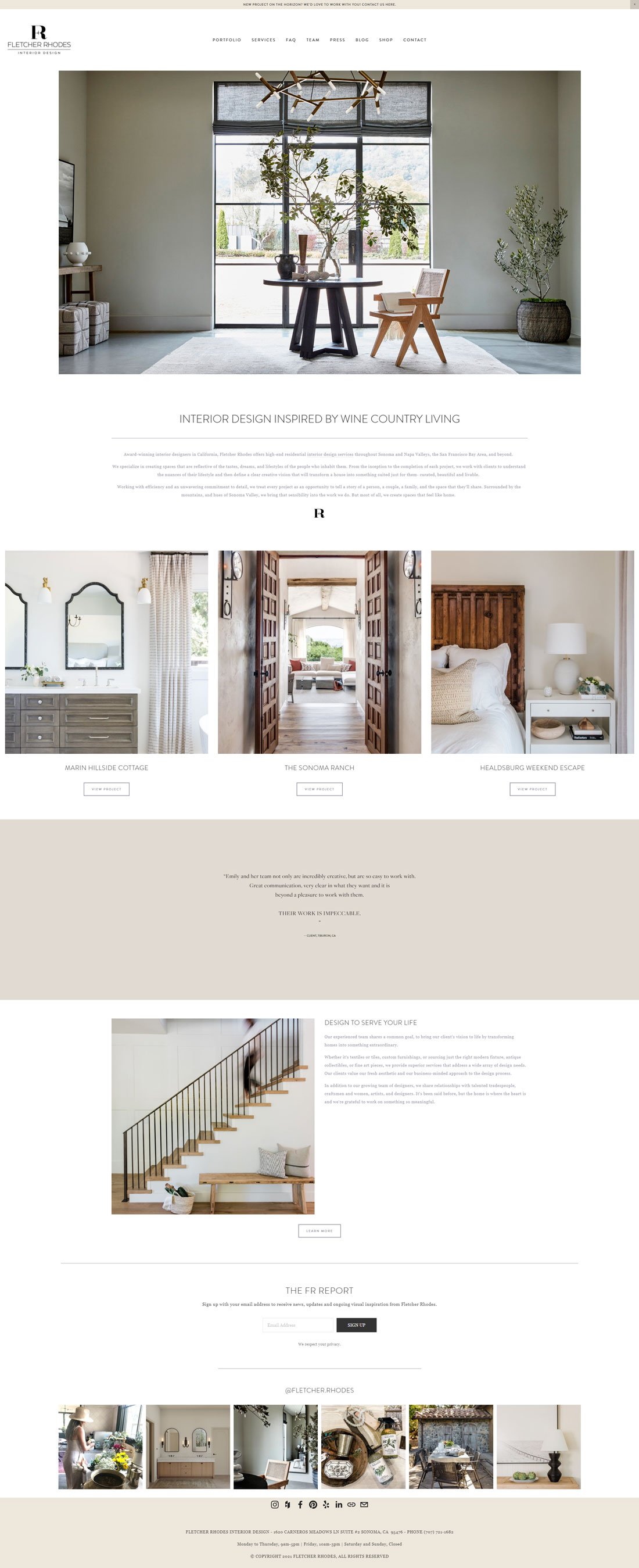
Website: Fletcher Rhodes Interior Design
Website Designed By: Megan Marsh King Creative
Stunning. No other words required. Between Fletcher Rhodes exquisite work and photography with the skilled design of Megan Marsh King Creative, this Squarespace site sets the bar high.
Both Fletcher Rhodes and Megan Marsh King Creative are located in Sonoma - twenty minutes from where I live in Napa, CA on the other side of Wine Country. I met Fletcher-Rhodes when attending the Design Influencers Conference in San Francisco in 2020 and I’ve been in love with their work since!
Website: Rachel Usher Interior Design
Website Design: Kayleigh Noele Web Design
If this isn’t total interior design site inspo, then I don’t know what is! I swoon for black and white and so I love all the imagery presented below. The only thing better than a charcoal and cream room is when it has a charcoal arch like the first picture! I love the font with its subtle Art Deco vibe.
Website: KT2 Design Group
Website Design: JPW Design Studio
KT2’s website features full bleed imagery on the landing page with clear navigation for their architectural and design services as well as furniture sold on their shop through Side Door. If you haven’t heard of Side Door yet, it’s is a new app allowing interior designers to curate collections through their trade vendors and share them with clients directly via a website or social media.
Website: Natalie Jones Designs
Website Design: My Wolf Design Inc.
The white background lets the neutral imagery speak for itself. Modern, sophisticated typography, light and dark neutrals with subtle gold tones - a winner.
Website: Beauty Is Abundant by Leah Alexander
This site has a nice mix of traditional interior design services with digital services like edesign and scalable products including an ebook aimed at interior designers. The homepage includes a video of her which is a genius idea for quickly allowing potential clients to instantly get a feel for how it might be to work with a designer without a meeting.
Website: Ania Trica Design Studio
Website Design: ByRosanna Design
This site feels so clean and minimal yet almost cozy at the same time. The cream-almost-green and soft grays are very soothing, the navigation typewriter font is charming and of course, beautiful photography is key.
Website: House of Harvest
Website Design: DIY - In House
House of Harvest did a fantastic in-house job designing their Squarespace ecommerce website. The beautiful photography style of the vintage and antique farmhouse finds are set off perfectly by the white and black color scheme. Plus their weathervane logo is just so charming!
Website: Tami Faulkner Interior & Spatial Design
Website Design: Jodi Neufeld Design Studio
Jodi Neufeld’s homepage for Tami Faulkner has an emphasis on the workspace, showcasing her design process and workflow with a beautiful aesthetic. It highlights her hands-on collaborative approach to interior design.
Website: Kiyonda Powell Design Studio
Kiyonda Powell Design Studio’s site uses contrasts of black, white, and jewel tones really effectively. I also love the bold and creative navigation using circular imagery rather than the usual text links. My eye also keeps going to the logo with it’s streamlined, san-serif font.
Website: Shawback Design
Website Design: Coupar Consulting
The site created by Coupar showcases mostly Napa Valley Wine Country projects both hospitality and residential with an emphasis on indoor-outdoor lifestyle. Their Services page clearly specifies the design services they provide since they extend beyond what many firms offer.
Website: Kristen Ridler Interior Design
Website Design: JPW Design Studio
JPW Design Studio uses full bleed imagery for Kristen Ridler Interior Design. When your work and photography look like that, what more is needed?
Website: Dreams + Jeans
Website Design: Jodi Neufeld Design Studio
I wanted to show at least one blog site and designer Jodi Neufeld did an amazing job for blogger Dreams + Jeans. The layout, photography, and color scheme all look seamless and gorgeous. Her affiliate-linked shopping and social feeds are prominently displayed since that’s the priority for a blog as opposed to a service-based creative business where the portfolio is usually front and center.
Website: oi studio
Sophisticated, streamlined furniture deserves a website that delivers the same. oi studio’s site is a great example of effectively using white space and minimalism to allow the product imagery to standout. And it doesn’t hurt that I love the furniture - those zebra wood curves are all kinds of fabulous.
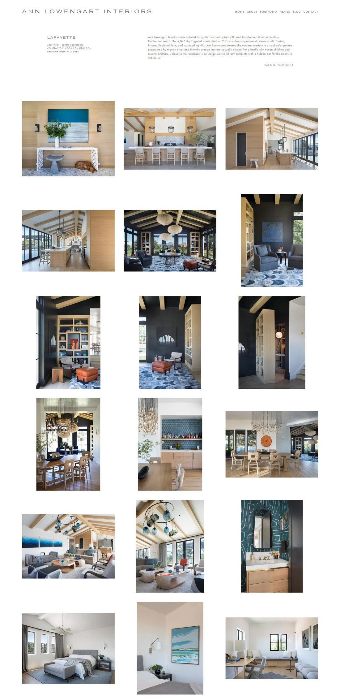
Website: Ann Lowengart Interiors
Website Design: Coupar
This portfolio page for Ann Lowengart by Coupar is clean yet colorful with lots of white space. I really like how they didn’t worry about forcing every image into the identical-sized frame. Look closely - they don’t all match up, yet careful attention is paid to balance. The first row has a different aspect ratio on the left with two identical images on the right, while the row below has two identical on the left and a portrait image on the right. Keep working your way down to see the patterns.
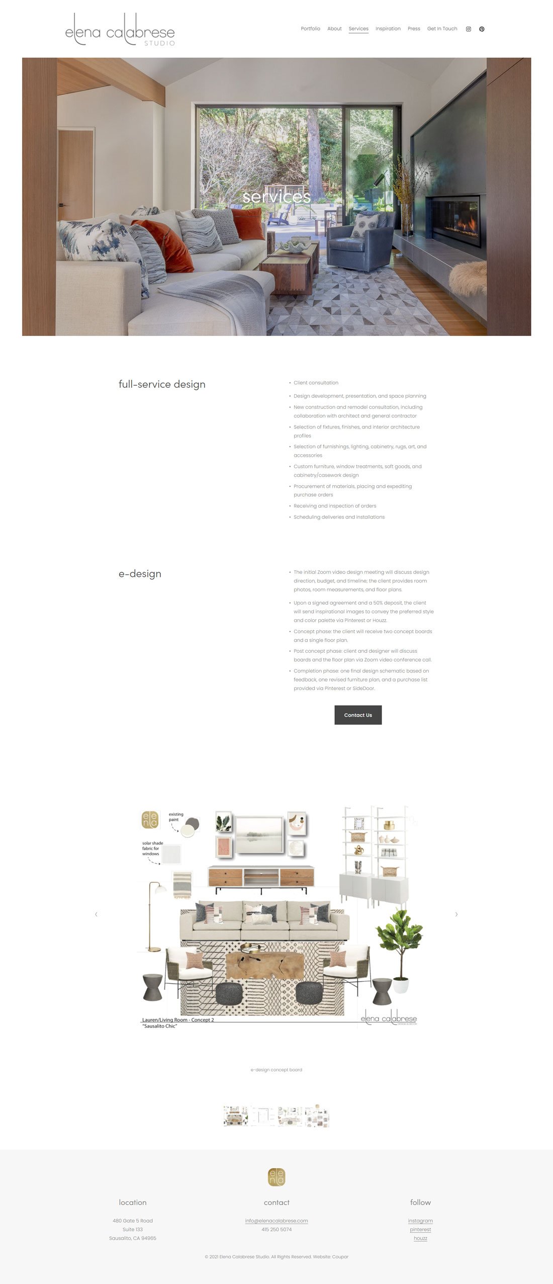
Website: Elena Calabrese
Website Design: Coupar
Elena Calabrese Studio’s Services page clearly lays out what the firm does including an image of their edesign service deliverable combined with a clear call to action below.
Website: Alex Cole
Website Designed By: Megan Marsh King Creative
Here’s another Squarespace ecommerce site for Sonoma artist Alex Cole. The homepage displays featured artwork and introduces you to the artist including video showing her at work in her studio. The color palette works perfectly with her landscape paintings. (Side note - I was happy to come across this site since I remember Alex as another preschool mom when my twin sons went to the same school with her daughter for the two years we lived in Sonoma.)
Website: Lotus Bleu
Website Design: Coupar
Full bleed imagery sets the tone for Lotus Bleu interior design studio. The logo and call to action button coordinate perfectly with the mustard rug and the Marin mid-century modern vibes for their homepage.
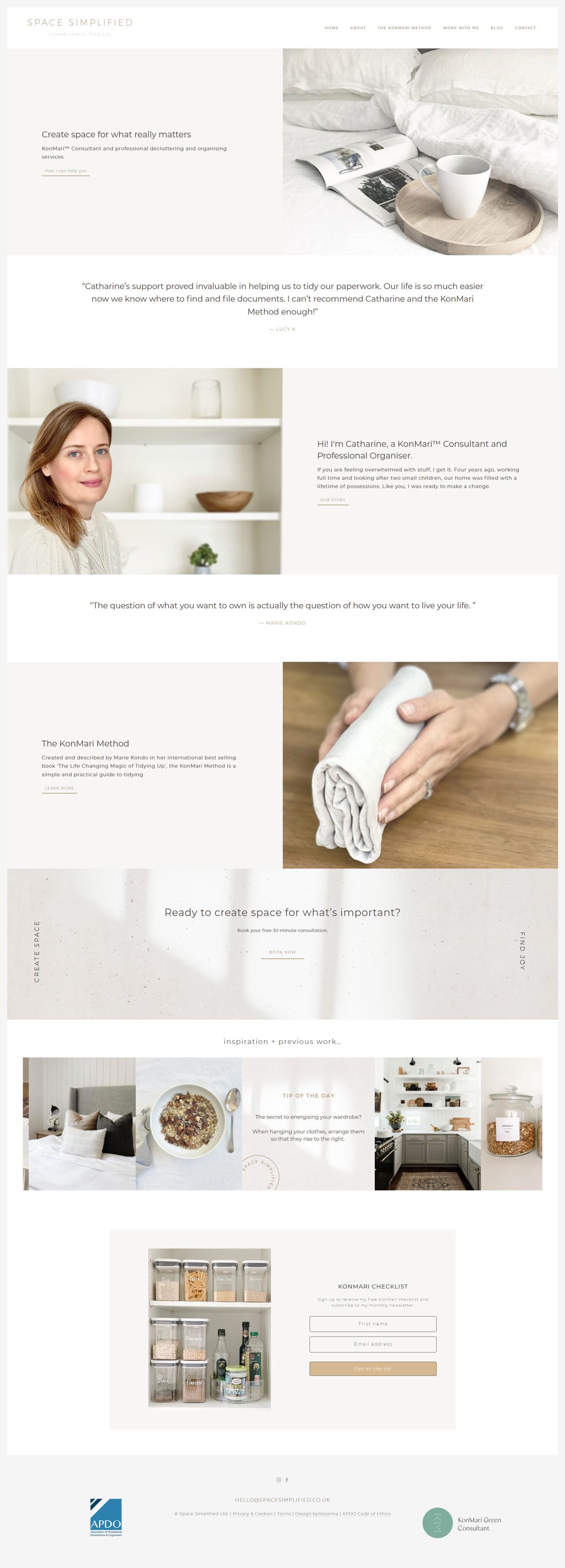
Website: Space Simplified
Website Design: ByRosanna Design
Here’s a site for professional organizer, Space Simplified, where the landing page presents clean, calm design with an alternating layout - text left, image right, then social proof via a testimonial, and then the reverse layout below. Rinse and repeat - it works.
Website: Jacqueline Rush Lee
Website Design: Lightpress
Artist Jacqueline Rush Lee’s website has a simple layout with no text save the header and footer that lets the exquisite subject matter and photography do all the talking. Enough said.
Other creative business-building posts you’ll love:
Don’t forget to Pin it for later!
If you have any questions or comments, please drop me a note below. Be sure to check back for my response (I always respond) since no notification is sent.

