5 Tips To Elevate Your Interior Design Website
As an interior designer, your website is your online portfolio. Even if potential clients discover you on social media or in-person, your website is where they go to learn more about you, check out your work, and find out more about your services. So it goes without saying that your website needs to support your work and your brand.
In this post, I’ll be sharing five tips to help you elevate your interior design website to help convert more visitors into clients.
Showcase with Video
Elegant & Effective Typography
Effective Use of White Space
Highlight Testimonials
The Power of Calls to Action
Showcase with Video
Want a sure-fire way to boost engagement with your visitors? Include a short video on your homepage. It goes without saying that video is eye-catching and engaging. We can’t help but look!
Video can be processed by our brains faster than text, so you can say more with fewer words.
A short video with curated clips showcasing your work and highlighting you doing the work can convey a powerful marketing message in just a few short seconds. It’s much more impactful than a page full of text talking about your work.
Scaled Up Studio’s homepage features a short video that helps convey my brand aesthetic and connect with my ideal clients.
Elegant Typography Supports Your Brand
Typography is the art of arranging letters to make text legible and visually appealing. Font is a specific typeface used for typography. As a whole, they affect how your visitors read and interact with your content.
I consider typography/fonts to be the unsung hero of web design. it doesn't get the glory or attention of imagery, but it has a big impact on site design even if readers aren't aware of it.
Fonts play an important role in conveying the mood of your text, website, and your brand identity. Fonts in particular have a huge impact on setting the style and tone of copy, so it’s important to select fonts that support your brand aesthetic.
When choosing a font for your website, consider the mood you want to convey. Serif fonts, such as Playfair, Times New Roman, or Baskerville, convey a traditional and classic feel. (A serif is a small decorative stroke found on the ends of letters. I like to think of them as “feet.”) While sans-serif fonts, such as Helvetica, Futura, or good old Arial, are more modern and clean since they do not have the end strokes.
It's also important to choose a font that’s easily legible on both desktop and mobile at a range of sizes with appropriate line spacing since more than half of web traffic comes from mobile devices.
League Spartan is a san-serif font that pairs well with the more traditional, serif font Libre Baskerville.
Font Choices
A rule of thumb is keep the number of fonts on your site to a minimum. Two is the most common rule of thumb; three max and that can be pushing it if they don’t “speak to each other.” The trick is combining fonts skillfully so they complement rather than compete with each other.
This leads to the last point which is typography is used to create hierarchy on your website. Different fonts, sizes, weights, and color are all utilized to draw attention to information. A “display” type font In a larger size is usually used for headings to draw attention to them. Body text is best communicated using extra legible fonts in a smaller size.
Links and calls to action get special attention through font type, weight, capitalization, and color.
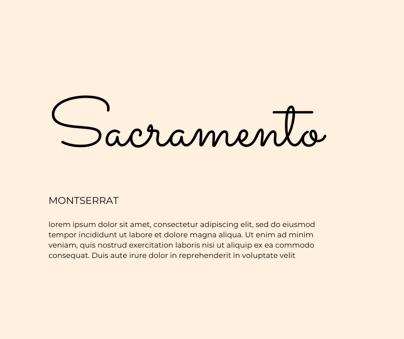
Sacramento is a Google font suitable for display. It pairs well with san-serif Montserrat for an all-caps sub-heading and body text.
Use of White Space
White space is empty space surrounding text, imagery and design elements. It gives your content breathing room so to speak. By providing the eye with a place to rest, it helps your content to stand out.
Enhances legibility
With the proper amount of white space between letters and lines, visitors can more easily read and comprehend your content. More importantly, they will be more willing to try to read and comprehend your content.
This is especially important because the honest truth is people will skim your writing rather than read it word for word. A giant block of dense, jumbled text is off-putting and will cause most readers to skip it and move on.
Back to the comment in the font section above about legibility on mobile and desktop, in addition to font selection and size, appropriate line spacing here is key. Google will penalize your SEO for type that is too close together making it difficult to read and to click on any links.
Creates harmony & reinforces your brand tone
The last thing you want is potential clients to feel cluttered and cramped when they are on your site. You would never design a room for them with those feels, so it goes without saying your website shouldn’t project that either.
A well-balanced site with skillful use of white space can help visitors feel comfortable and focused, setting a positive vibe for taking in your work.
Helps organize: When designing a website, the use of white space can help enforce visual hierarchy. Negative space helps create an organized flow between content on your pages, improving your site’s usability.
Propels visitors to take action: White space can highlight critical calls-to-action (CTAs), directing visitors, for example, to schedule an appointment, buy a product, or reach out for more information.
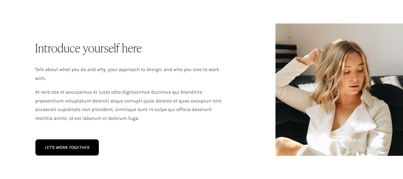
The Linden template for interior designers uses whitespace to allow the content to “breathe” and highlight key information.
Highlight with Testimonials
Testimonials are a powerful tool for building trust and credibility with potential clients. They provide social proof that your services are effective and that you have a track record of success.
Don't make the mistake of hiding testimonials away on a single page. Showcase them loud and proud on their own dedicated sections sprinkled strategically throughout your website.
Use attention-getting color and/or background images. Display fonts or body fonts in a heavier weight help to bring emphasis to the words of your happy clients.
It’s also a good idea to include a photo and name of the client to drive home the fact that these are real, happy clients!
That way your potential clients won't be able to miss them, and it will help build the know, like and trust factor between you and your visitors even faster.
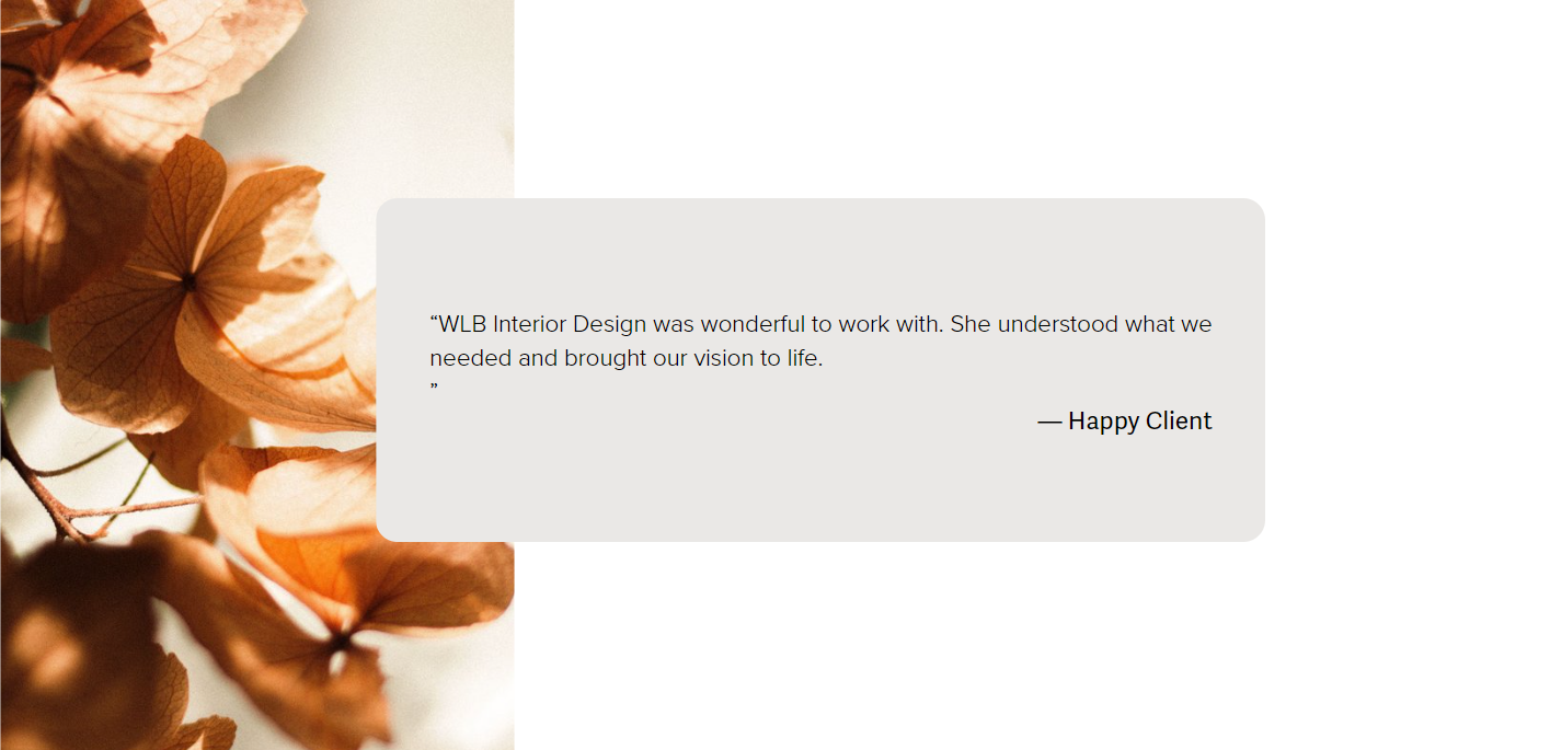
Showcase interior design client testimonials on your website with backgrounds, colors, and typography.
The Power of Calls to Action in Driving Conversions
A call to action (CTA) is a button or link that encourages your visitors to take a specific action, such as booking a consultation, purchasing a product, or signing up for your newsletter. They help drive conversions and turn visitors into clients and customers.
Think of CTAs as the “final act” of strategic website design because they are literally the “action activation” buttons/links on your site.
When designing your CTAs, make sure they stand out from the rest of your content. Use a contrasting color and make them large enough to be easily clickable on both desktop and especially mobile. CTAs definitely need their white space too so they stand out from the rest of your content and get the attention they deserve.
It’s also important to use action-oriented language, such as “Book Now” or “Get Started.” This will create a sense of urgency and encourage your visitors to take action.
CTAs need to be placed strategically on your website. Every page or content section should have a next step or a goal associated with it that you’re encouraging your visitors to perform. Your CTA buttons and links are your visitors’ prompt to take that specified action.
Calls to Action like the button above prompt interior design website visitors to take a next step.
Putting it All Together: Can You “Elevate” Your Website?
Now that you know these five tips, take a birds-eye view of your website and assess. Go over your website and identifying any places that might need a little elevating. A few tweaks can sometimes make a big difference.
Need a bigger change? Check out Website Launch Blueprint for Interior Designers.
What do you think is key to selling your interior design services on your website? Leave a comment below and let me know.
New to Squarespace? You can sign up for a free trial, and I can even get you a discount! Use code GREENHOUSE10 to save 10% off your first year. (affiliate link)
[This post contains affiliate links. Click here to read my full disclosure.]
Other interior design business-building posts you’ll love:
Don’t forget to Pin it for later!
If you have any questions or comments, please drop me a note below. Be sure to check back for my response (I always respond) since no notification is sent.


