
How to Create a Client-Winning Homepage
Your website homepage is the digital front door to your service business. Its main job? To welcome visitors, build trust, and guide them exactly where you want them to go. While it plays a supporting role in SEO and conversions, its primary purpose isn’t to rank or close a sale, it’s to direct traffic deeper into your site.
The real conversions happen on the pages your homepage leads to like your services, about, or contact pages — where visitors can learn more, build confidence in what you offer, and take action: booking a call, joining your email list, or making a purchase.
So how do you design a homepage that does its job well so that it earns trust and moves visitors forward?
That’s exactly what this post will show you. Whether you're building your first website or optimizing an existing one, you’ll learn how to structure a homepage that supports your entire business and turns browsers into buyers.

Homepage Structure for Service Business Websites
If we think of a website as a house, then your homepage is the foyer or entry hall. It's often the first thing visitors see. It’s crucial to make a good impression and capture their attention, but you also don’t want them lingering too long.
You want to warmly welcome them and convince them to stay for a while, and then direct your visitors into another room pretty quickly.
The structure of your homepage plays a crucial role in determining whether visitors will engage with your content or move on to another site. A well-structured homepage can help guide visitors through your site, highlight your services, and ultimately increase your conversion rate.
First, know your brand message and your ideal client
To create a clear value proposition, you first need to nail down the problem you solve and who you solve it for.
What are your target audiences’ biggest pain points and desires? What’s your unique perspective on solving their problems/meeting their desires that sets you apart from your competition?
Once you have a clear understanding on this, you can create a value proposition that resonates with them and speaks to their specific needs.
If you’re feeling clear as mud on all of this, I have a FREE tool to help:
Write a Clear and Compelling Headline
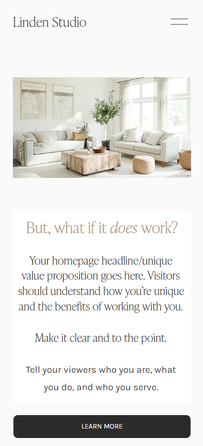
Your value proposition - or, in web design and marketing terms, your homepage headline or business tagline, is the unique selling point of your business.
It should be prominently displayed on your homepage in the hero section, which is the first section, and above-the-fold. (Above-the-fold means it can be seen without the viewer having to scroll.) .
Add a subheading to provide context to your main headline as needed.
Your value proposition/homepage headline/business tagline should be simple, specific, and memorable. It should answer the question, "How are you different from your competitors?" In other words, what do you do, who do you serve, and why should someone choose to work with you?
Here’s an example:
I/We help [ideal client] [solve problem / achieve result] by/with [service/action/product]
“I help home sellers get higher offers in less time through strategic staging”
Need help crafting your brand tagline/homepage headline?
Showcase Social Proof
Testimonials, case studies, and client logos can significantly enhance your credibility and build trust with potential clients. Highlight positive feedback and success stories to demonstrate the value and quality of your services.
Social proof can provide the nudge your potential clients need to make them feel comfortable enough to “convert”, e.g. book a call, schedule an appointment, purchase, join your email list etc.
Place social proof right below the hero section of the homepage. Include photos or videos of satisfied clients, as well as links to detailed case studies that showcase your expertise and results.
Clear and Prominent Call-to-Actions
Your call-to-action (CTA) is the action that you most want visitors to take on your homepage. Remember above when I made the website-is-like-a-house analogy? The homepage is the entryway/foyer and you want to warmly greet your visitors and then direct them to another room.
That my friend, is the job of a well-designed CTA!
Your CTA should be clear, concise, and prominently displayed because it’s sole job is to encourage potential clients to take action.
You will have more than one CTA on your homepage, but the most important one should be located above the fold (the upper portion of the page that’s visible when your webpage loads).
For many service business sites, the primary CTA will be to encourage people to schedule a call or make an appointment. I recommend placing it in your header.
Feature Your Services & Link
Visitors will want to learn more about you and your work first, so the body of your homepage should briefly introduce you/your team and discuss your services and include CTAs directing them to the pages where they will get the information they need to make a decision about whether or not to take the next step toward working with you/purchasing from you.
To create an effective CTA, use action-oriented language that will address the pain-points and/or desires of your ideal client community. Make your CTA prominent and experiment with button styles, color palettes, typography, and placement to determine what will be the most effective.
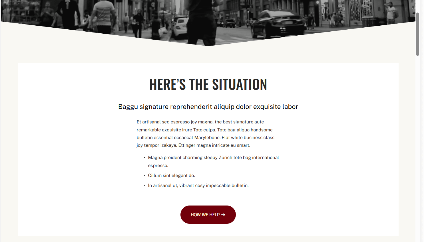
My ‘Oxford’ custom Squarespace template has prominent homepage CTAs language that relates to it’s associated text and a bright accent color.
Create a Navigation Menu That's Easy to Use
Your primary navigation menu, located in your website header, is the roadmap for the most important pages of your site. It should be prominent, simple, and clearly organized.
To avoid overwhelm, I recommend not having more than 6 links.
The reason is there’s a marketing psychology phenomenon called “Choice Overload Bias” where when presented with too many choices, people feel overwhelmed, which can lead them to avoid making any choice at all.
Submenus that drop-down from your links are fine, but don’t clutter up your primary navigation with excess links.
See the above image - the Primary Navigation has four links - About, Portfolio, Services, Blog. The Homepage is accessed via the site title/logo on the left and the header CTA is the Contact button.
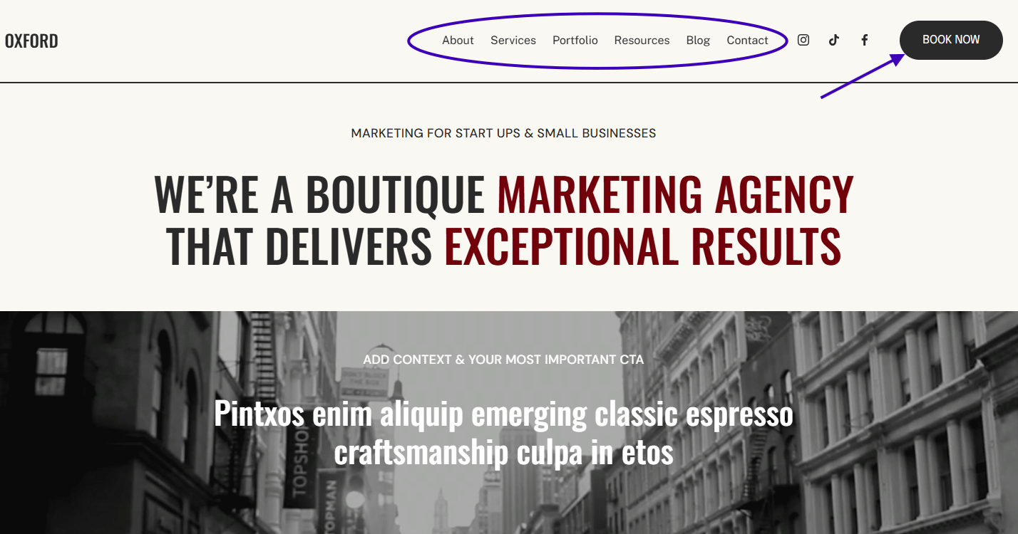
Keep your website’s primary navigation simple - only link to your most important pages.
Don’t Forget To Optimize Your Homepage for Mobile Devices
Chances are, at least half of your website traffic will come via mobile device. Ensure that your homepage, and the entire website, displays correctly and functions smoothly on all screen sizes.
Test your website on various devices and browsers to identify and fix any issues. A mobile-friendly website not only improves user experience but also positively impacts your search engine rankings.
If your website is built on a platform like Squarespace, a mobile layout is performed automatically, and you just makes tweaks as needed. How much work goes into creating a mobile-responsive design varies greatly from platform to platform.
Squarespace’s mobile-responsive preview. Note the primary navigation is condensed into a “hamburger” menu.
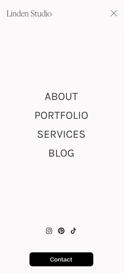
The hamburger menu when touched expands to display the primary navigation.
There you have the main components of an effective homepage. I hope you got some good ideas for either a new homepage or inspo to spruce up your existing one.
If you have any questions, don’t hesitate to leave me a comment below.
Don’t forget to Pin it for later!
If you have any questions or comments, please drop me a note below.
Be sure to check back for my response (I always respond) since no notification is sent.